Build it
Make it sell
Keep it running

Packaging design
A pack is seen at two metres on a shelf, at reading distance in a hand, and at four hundred pixels on a white product page. Those are different problems, and solving one of them often breaks another.
The two ends
On a shelf a pack is seen from two metres, at an angle, beside competitors, under light nobody chose. It has to be identifiable before it is readable — a shape, a block of colour, one word. Detail at that distance is not detail, it is noise.
On a product page the same pack appears at four hundred pixels, alone, on white, with nothing beside it to compare against. Now the detail is the whole argument: the surface, the finish, the small print that somebody will zoom in to read before deciding.
Designing for one end and photographing for the other afterwards is where most of the avoidable cost hides. We plan both from the start — the packshot session is booked while the artwork is still open, not after it has gone to print. On the shop side that continues into the product page itself.
In this order
Once tooling exists, the first group is settled for the life of the product. Everything after it can still be changed.
Stage one
The unglamorous part, and the one most often skipped.
Stage two
Where the pack becomes recognisable at both distances.
Stage three
Four checks that cost a day and save a print run.
The reason stage one gets the emphasis is that it is the only one where a mistake is permanent. A colour can be adjusted between runs; a die cannot. Which is also why we ask for your producer’s specification before we ask what the pack should look like — and why the identity needs to exist before any of this starts.
What you receive
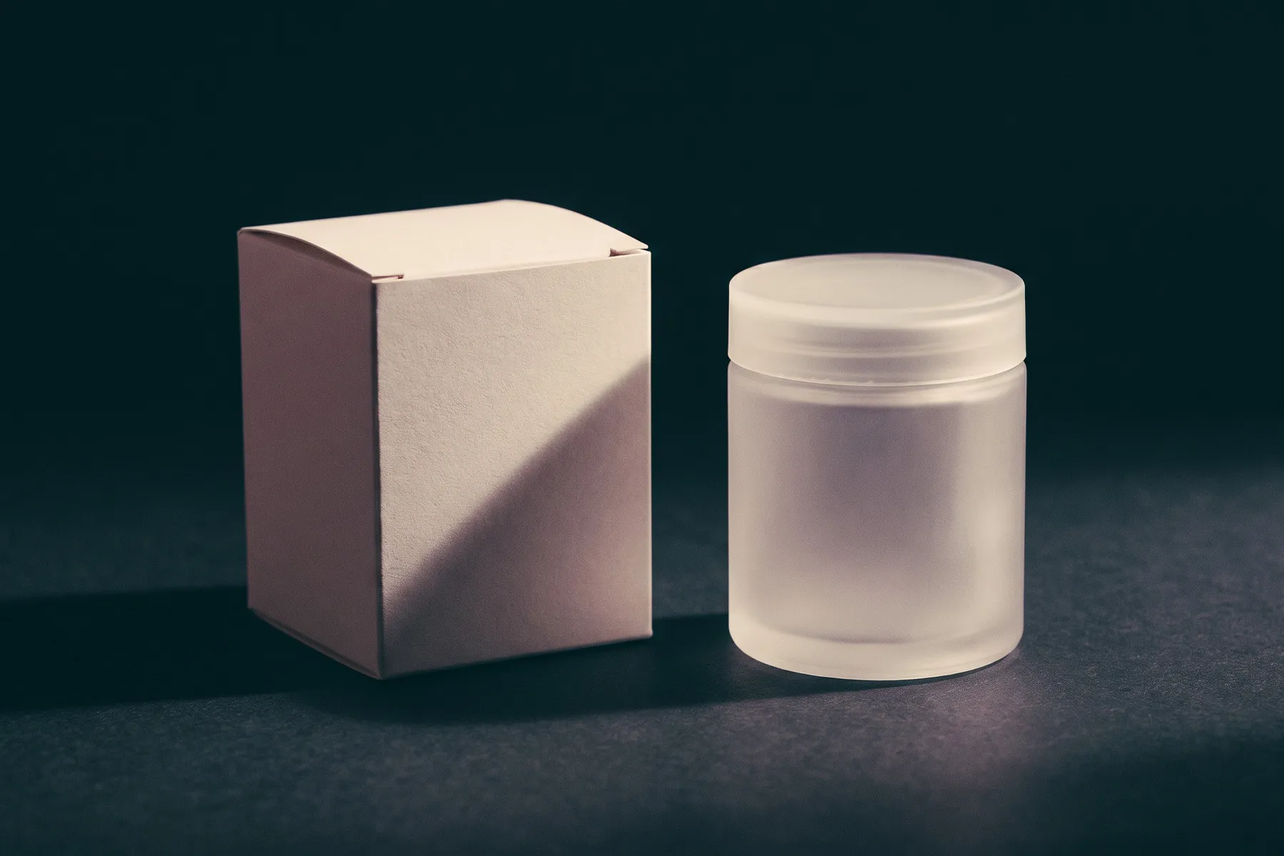
The packshot is the item most often forgotten and the one your shop needs first. Photographing the pack while the artwork is still open costs almost nothing; doing it six weeks later, after the run, means booking a session for a single object. More on how the two halves connect on the brand and shop page.
If you do, send us their dieline and material specification — that is the entire starting point. If you do not, that is the first thing to settle, and we will tell you exactly what to ask them for.