Corporate identity

A logo is the smallest part of it.

An identity is a set of decisions written down clearly enough that everything made afterwards can be made without asking. Colours with their values, type with its licences, spacing, and the reasoning behind each one.

The common misunderstanding

It is not a logo with a colour beside it.

Most companies commission a logo and receive a logo. Six months later somebody makes a flyer, picks a slightly different green because the right file was not to hand, sets it in whichever typeface was already installed, and the brand has quietly begun to dissolve. Nobody notices on the day. Everybody notices two years later.

An identity is what prevents that — not a document nobody opens, but a set of decisions specific enough that the next person does not have to decide again. What the green is, in print and on screen. Which typeface, in which weights, licensed for what. How much room the mark needs around it. What happens on a dark background, on a photograph, in one colour.

It is the least glamorous thing Bianca makes and the one that saves the most money, because every later job starts from something instead of from nothing. That includes the shop — which is the whole argument on the brand and shop page.

What is actually decided

Six decisions, and what each one prevents.

None of these are rules for their own sake. Each one exists because it has gone wrong somewhere, usually expensively.

Colour, with values for print and for screen
The slightly-wrong green on the flyer, and a palette that fails contrast the moment it becomes text on a background rather than a square on a slide.

Type, with weights and licences
The substitute typeface in week five, and the licence question that otherwise surfaces after everything has already been designed around it.

Spacing and clearance around the mark
The mark crowded by whatever ended up next to it — the single most common way a good logo is made to look cheap, and the easiest to avoid.

Behaviour on dark, on photographs, in one colour
The version somebody improvises at eleven at night because the situation was not covered, which then lives on in half your material for years.

The smallest and largest size it is allowed
A favicon that has become a grey blob and a trade fair wall where the detail falls apart. Both ends of the format ladder matter.

The reasoning, written down
The argument in year two about why it is like that — and it lets a new colleague make a decision the way it would have been made, without anyone having to be asked.

Every one of those six has cost somebody money in a project we have seen. Not usually a lot at once, which is exactly why it goes unnoticed until the material no longer looks like it belongs together.

What you receive
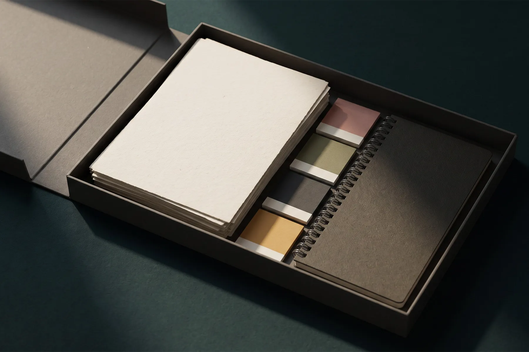
A folder your team can actually use.


  • The colour systemEvery colour with its print, screen and web values, and the pairs that are allowed as text on background.
  • The type systemTypefaces, weights, sizes and line spacing, with the licence for each one and what it covers.
  • Logo files, sortedEvery version and format, named so that the right one can be found by somebody who was not in the meeting.
  • Rules and clearanceMinimum sizes, space around the mark, what is allowed on dark and on photographs, and what is not.
  • The guide as a PDFShort enough to be read, specific enough to settle an argument. Written after the decisions, not instead of them.
  • Editable source filesYours to keep. If you ever work with somebody else, they can carry on rather than start again.

The last one is not standard in this industry, and it should be. A brand you cannot edit without the original agency is not entirely yours. More on that in brand kits.

You probably already have a logo.

Most companies do. The question is whether there is anything behind it — and if there is not, finishing what exists is a smaller job than starting over. Send us what you have and Bianca will tell you which it is.